
Gujarat Board Statistics Class 11 GSEB Solutions Chapter 2 Presentation of Data Ex 2.3 Textbook Exercise Questions and Answers.
GSEB Class 11 Statistics Presentation of Data Ex 2.2 Solution
GSEB Textbook Solutions Class 11 Statistics Chapter 2 Presentation of Data Ex 2.3
Question 1.
Following is the data on the number of employees working in various Government departments. Present it with a suitable diagram.
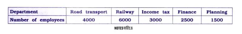
Answer 1.
In this diagram, departments are on the horizontal axis (X-axis), and each centimeter represents 1000 employees.
The bars represent the number of employees in each department.
This simple bar diagram is suitable because we’re only focusing on the variable of the number of employees in different departments.
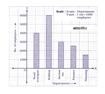
Question 2.
The data on the profit of a company is as under. Present it by an appropriate diagram.
Answer 2.
In this diagram, years are on the horizontal axis (X-axis), and profits are on the vertical axis (Y-axis), with each centimeter representing a 2 crore profit.
The bars represent the yearly profits.
This simple bar diagram is appropriate because we are focusing on the single variable characteristic of yearly profit in different years.
Question 3.
Changes in the price of share of 5 companies at Mumbai Stock Exchange during an interval of 15 days are as follows. Present them by a suitable diagram.
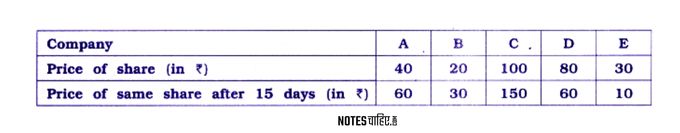
Answer 4.
In this diagram, companies are on the horizontal axis (X-axis). The closing price of shares and the closing price of shares after 15 days are on the vertical axis (Y-axis), with each centimeter representing a scale of 20.
Multiple bars are drawn for each company, illustrating the two variable characteristics.
This type of diagram is called a multiple bar diagram and is suitable for comparing the closing prices of shares and their values after 15 days for different companies on the Mumbai Stock Exchange.
Question 4.
Information regarding the birth rate and death rate of 5 countries is as under. Present it by a suitable diagram.
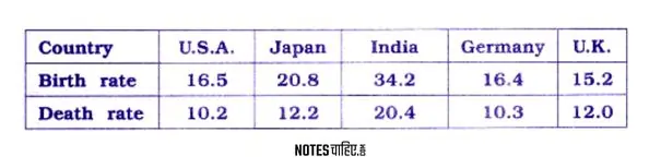
Answer 4.
In this diagram, different countries are represented on the horizontal axis (X-axis). The birth rate and death rate are shown on the vertical axis (Y-axis), with each centimeter representing a scale of 5 units.
Multiple bars are drawn for each country, illustrating both the birth rate and death rate.
This type of diagram is called a multiple bar diagram and is suitable for comparing the birth and death rates of different countries during a year.
Question 5.
Information regarding the age of persons living in two different regions is as under. Present it by using an appropriate diagram.
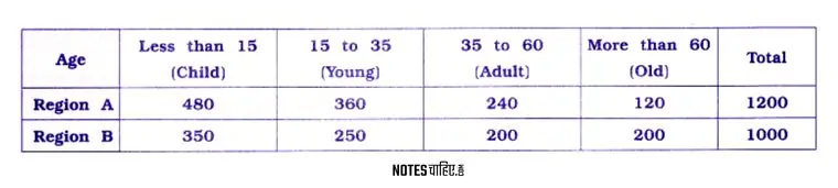
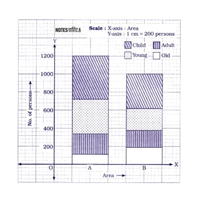
Answer 5.
In the divided bar diagram, the data on different age groups is represented. The diagram includes a table indicating dividing lines for various age sections within each bar.
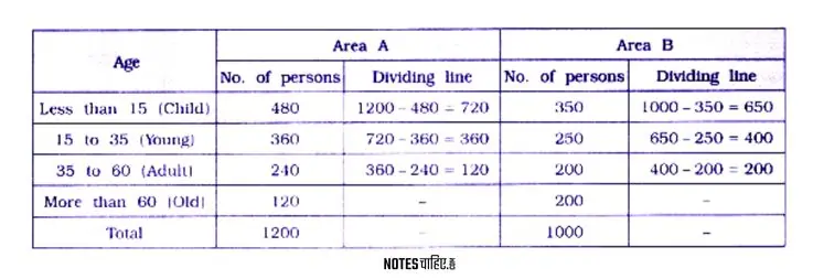
In this divided bar diagram, the X-axis represents Areas A and B.
Bars are drawn with appropriate width and length, where the length is proportional to the number of persons in each age group.
The Y-axis scale is set at 1 cm = 200 persons.
This divided bar diagram visually displays the age distribution of individuals in both Areas A and B, making it easy to compare the demographic composition of the two areas.
Question 6.
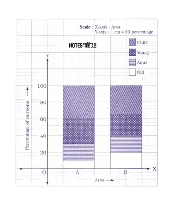
Draw the percentage divided bar diagram for the data given in example 5.
Answer 6.
The table showing the percentages of different sections of age taking 100 percentage for the total number of persons in two areas is prepared as follows :
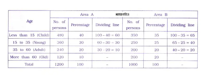
In this percentage divided bar diagram, the X-axis represents the different areas, and the Y-axis represents percentages, with a scale of 1 cm equal to 20 percentage points.
Bars for Area A and Area B are drawn with appropriate width and length, where the length is proportional to the percentage of individuals in each age group.
The diagram visually displays the age distribution of persons in both areas, making it easy to compare the proportion of different age groups in each region.
Question 7.
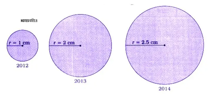
A car production company has during produced the following number of cars during three years. Represent it through a circle diagram.
| Year | 2012 | 2013 | 2014 |
| Production of cars | 25,600 | 1,02,400 | 1,60,000 |
Answer 7.
To draw circle diagram for the given data, find the square root of the production of cars and dividing it by 160, we get the radius of circle for the production of different years.
We prepare the table as follows :
| Year | Production of cars | Square root | Radious Square root 160 |
| 2012 | 25,600 | 160 | 160160 = 1.0 |
| 2013 | 1,02,400 | 320 | 320160 = 2.0 |
| 2014 | 1,60,000 | 400 | 400160 = 2.5 |
Drawing circles taking radius corresponding to production of cars in different years. Circle diagram is obtained as follows :
Question 8.
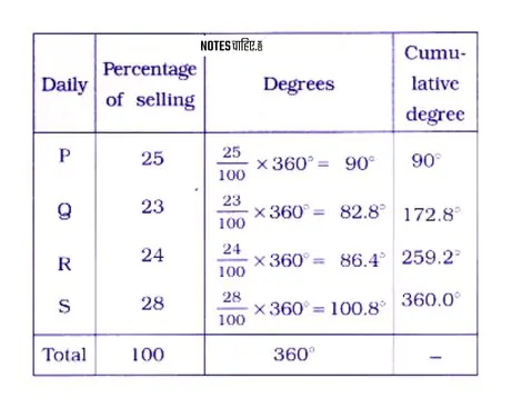
The following data represent the percentage sales of copies of daily newspapers. Represent it by pie diagram.
| Newspaper | P | Q | R | S | Total |
| Percentage of selling | 25 | 23 | 24 | 28 | 100 |
Answer 8.
Taking total sales 100 percentage = 3600, we find the degrees for the sales of different dallys. The table is prepared as follows:
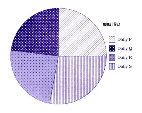
Taking an appropriate radius we draw a circle and divide it according to the degrees of the sales of different dailys, we get pie diagram as follows :
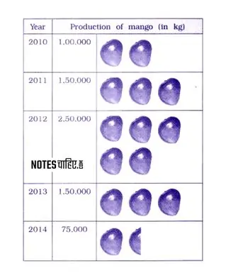
Question 9.
Represent the following information by a pictogram:
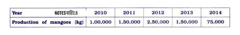
Answer 9.
Here, the production of mango (in kg) for the year 2010 to 2014 is given. Taking 1 mango picture for 50,000 kg production of mango, the pictogram for given data is prepared as in figure:
Question 10.
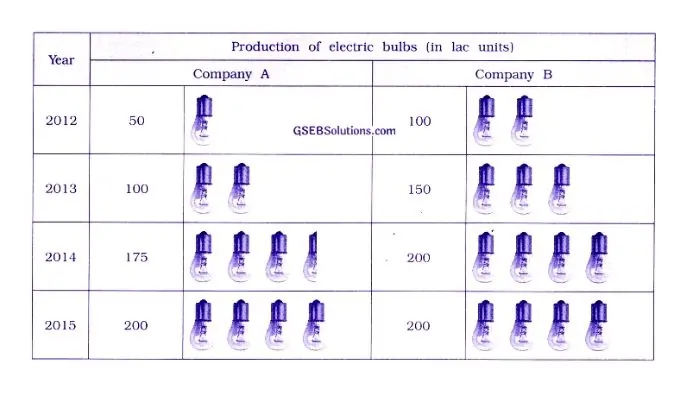
Details of production of electric bulb by two well-known companies are as under. Represent them by a pictogram.
| Year | Production of electric bulbs (in lac units) | |
| Company A | Company B | |
| 2012 | 50 | 100 |
| 2013 | 100 | 150 |
| 2014 | 175 | 200 |
| 2015 | 200 | 200 |
Answer 10.
Here, the production of electric bulbs (in lac units) of two companies A and B are given for the year 2012 to 2015. Taking 1 bulb for the production of 50 lac electric bulbs, the pictogram for the production of electric bulbs of company A and B is prepared as follows :
Leave a Reply